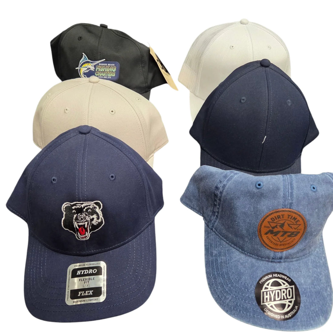
How to Match Promotional Cap Colours with Your Brand Identity
Share
Choosing the right colours for your promotional caps isn't just about aesthetics, it's about creating the perfect experience that makes your brand memorable. When your cap colours align perfectly with your brand identity, you transform a simple promotional item into a powerful marketing tool every time it's worn.
At trade shows across Sydney, corporate events in Melbourne, or community festivals in Brisbane, the right colour choice can make your promotional caps stand out from the competition while strengthening brand consistency.
Why Colour Matching Matters for Your Brand
Colour psychology drives purchasing decisions and brand perception. When your promotional caps feature colours that align with your established brand, you create immediate visual recognition that builds familiarity.
The Impact:
- Increased Brand Recognition: Consistent colour usage across all marketing materials, including promotional caps, boosts brand recall.
- Professional Credibility: Cohesive branding signals attention to detail and quality
- Cost-Effective Marketing: Well-chosen colours ensure your promotional caps get worn repeatedly, maximising your marketing investment
Understanding Your Brand's Colour Psychology
Before selecting cap colours, analyse what your current brand colours communicate to your target audience.
Corporate and Professional Brands
- Navy and Charcoal: Convey trust and professionalism, these colours can work well with companies involved in industries such as financial services, legal firms, or other B2B companies
- Deep Blues and Greys: Signal stability and expertise, these colours are ideal for consulting or technology businesses
Creative and Dynamic Brands
- Bright Reds and Oranges: These colours express energy, innovation, and boldness, suitable for marketing agencies or fitness brands
- Vibrant Greens: Brands that are focused on growth, sustainability, and freshness can best utilise this colour. This palette is also excellent for environmental or health-focused companies.
Premium and Luxury Brands
- Black and White: Deliver sophistication and exclusivity
- Rich Purples or Deep Burgundy: Suggest premium quality and elegance
Strategic Colour Selection for Different Cap Types
Different promotional cap styles work better with specific colour approaches, depending on your branding goals and target audience.
Baseball Caps for Corporate Events
Classic custom baseball caps work best with your primary brand colours. If your logo features multiple colours, choose a neutral cap base to make your branding pop without overwhelming the design.
Caps for Casual Brand Activation
Promotional trucker caps and custom urban caps offer more creative freedom. Use complementary colours from your brand palette. For example, if your primary colour for the promotional caps you ordered is blue, consider caps in white or grey with blue mesh backing to maintain brand consistency while adding visual interest.
Practical Colour Matching Strategies
The 60-30-10 Rule
Apply this interior design principle to your promotional caps:
- 60%: Use your primary brand colour for the cap body
- 30%: Incorporate your secondary colour in details like the brim or stitching
- 10%: Add accent colours in small elements like eyelets or button tops
Complementary Contrast Approach
Choose cap colours that complement rather than match your logo exactly. A white cap with a navy logo creates a stronger visual impact than navy-on-navy, ensuring better readability and brand recognition.
Seasonal Adaptations
Adjust your colour selections for different times of the year while maintaining the consistency of your brand's image:
- Summer Events: Lighter shades of your brand colours work better in the harsh Australian sun
- Winter Promotions: Deeper, richer versions of your brand palette suit beanies and cold-weather caps
How To Test
Before placing bulk orders, test your colour choices:
- Sample First: Order samples in your proposed colours to see how they look with your logo in real lighting conditions.
- Consider Durability: Ensure your chosen colours maintain their vibrancy through washing and regular wear.
- Check Versatility: Verify that your selected colours work across different promotional cap styles you might use
Making the Investment Count
Quality colour matching requires working with suppliers who understand brand consistency. Look for promotional cap suppliers who offer:
- Colour matching services using Pantone references
- Pre-production samples for approval
- Consistent colour reproduction across large orders
- Advice on colour durability for different cap materials
Your promotional caps represent your brand every day they're worn. Investing in precise colour matching ensures every impression reinforces your professional image and marketing objectives.
Ready to Match Your Brand Perfectly?
Choosing the right colours for your promotional caps shouldn't be guesswork. Our team understands how colour psychology impacts brand perception and can guide you through selecting the perfect combination for your next campaign.
Whether you're planning for trade shows in Sydney, corporate events in Melbourne, or community festivals across Australia, we'll help you create promotional caps that strengthen your brand identity while delivering practical value that your audience will appreciate.
Contact Us!
Contact us today for expert colour matching advice and samples that showcase your brand at its best.
